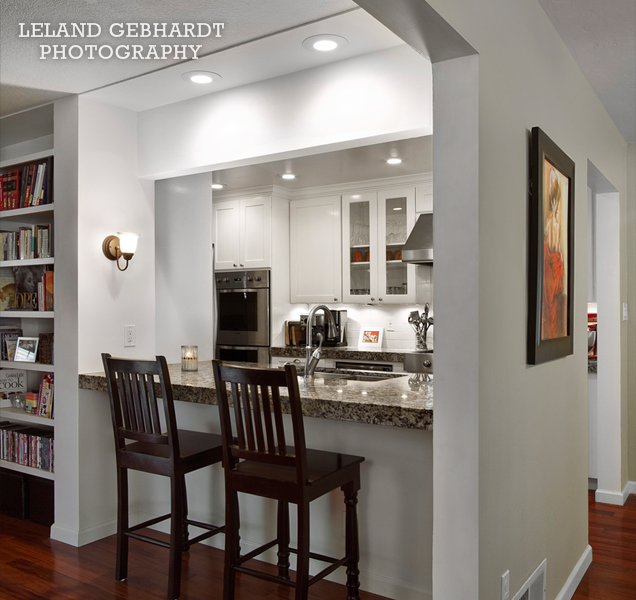
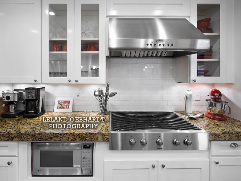
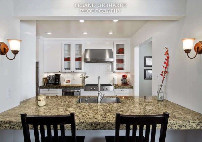
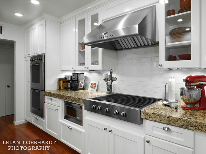
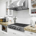
Photographing interiors is a fun challenge, completely different from using people as my subject. The three biggest concerns with interior shots are (1) handling mixed lighting, (2) getting all your angles at the right perspective so they don’t look distracting, distorted, or mislead your perception of the space, and (3) keeping it looking natural. This interior needed more time to shoot because of the lighting, but nonetheless is was easily corrected. Several of the lights in this kitchen use regular tungsten bulbs which are fairly warm in color temperature. Anytime you see a photo and the color looks orange, that’s the actual color of the light from that light bulb. There’s also a second set of lights under the cabinets with a different color temperature. Yet again, the windows letting in ambient light have a sun reducing tint applied, which is fairly purple. Just to add more to the challenge, my lights are strobing white light.
In order to give the appearance of smooth lighting and one constant temperature, I had to take many multiple shots on a tripod adjusting both the exposure and the white balance in the camera. There was also a considerable amount of post-processing done afterwords, but the results turned out great!
Like many interiors the spaces can be tight and you may need to get an entire space into the shot. A wide angle lens was used to capture these extremely wide views, but normally a wide angle lens will give a “fish eye” distortion that curves every straight line. Here the straight and vertical lines were accomplished by using a wide angle lens with aspherical elements.
The client for this shoot was an interior designer. This kitchen will be another addition to his already brilliant portfolio.




June 16, 2010
Architecture, Interior